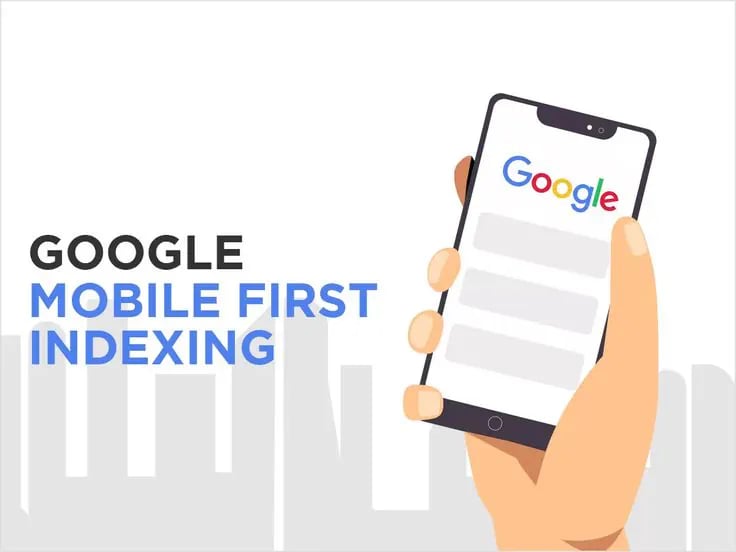
Tại Việt Nam, phần lớn lượt tìm kiếm Google và traffic thương mại điện tử đến từ điện thoại. Và Google đã chính thức chuyển sang Mobile-First Indexing — nghĩa là Google dùng phiên bản mobile của website để index và xếp hạng.
Hệ quả rất thẳng thắn: site mobile kém thì Google đánh giá kém; desktop tốt nhưng mobile tệ cũng vô nghĩa; và nội dung chỉ có trên desktop sẽ không được index.
Bài viết này giải mã toàn bộ Mobile-First Indexing và cách tối ưu chuẩn Google. Bài dành cho: frontend developer, designer, SEO specialist và chủ website không muốn mất thứ hạng.
Phần 1: Mobile-First Indexing là gì?
Theo Google, hệ thống sử dụng phiên bản mobile của nội dung website — được crawl bằng smartphone agent — để index và xếp hạng. Đó là mobile-first indexing. Nói cách khác: Google crawl mobile trước, index nội dung mobile, và xếp hạng dựa trên mobile. Phiên bản desktop gần như không còn ý nghĩa với SEO.
Google cũng lưu ý: không bắt buộc phải có phiên bản mobile để nội dung được đưa vào kết quả tìm kiếm — nhưng điều đó được khuyến nghị rất mạnh mẽ. Không có mobile version nghĩa là vẫn được index, nhưng đánh mất rất nhiều sức mạnh xếp hạng.
Hiện tại, tất cả website đều đã được index theo mobile-first.
Phần 2: Ba cấu hình mobile-friendly
Yếu tố | Responsive Design | Dynamic Serving | Separate URLs (m-dot) |
|---|---|---|---|
Cùng URL | Có | Có | Không |
Cùng HTML | Có | Không | Không |
Bảo trì | Dễ | Trung bình | Khó |
Rủi ro SEO | Thấp | Trung bình | Cao |
Google khuyến nghị | Ưu tiên số 1 | Chấp nhận được | Chấp nhận được |
Responsive Design (khuyến nghị)
Google khuyến nghị Responsive Web Design vì đây là mô hình dễ triển khai và dễ bảo trì nhất: cùng HTML, cùng URL cho mọi thiết bị, chỉ khác CSS theo kích thước màn hình.
html
<meta name="viewport" content="width=device-width, initial-scale=1">css
/* Mobile first */
.container { width: 100%; padding: 1rem; }

/* Tablet */
@media (min-width: 768px) {
  .container { max-width: 720px; margin: 0 auto; }
}

/* Desktop */
@media (min-width: 1024px) {
  .container { max-width: 1200px; }
}
Ưu điểm: một codebase duy nhất, cùng URL, thân thiện SEO nhất, và bền vững với tương lai.
Dynamic Serving
Cùng URL nhưng server trả về HTML khác nhau dựa trên user-agent:
php
<?php
function isMobile() {
    return preg_match("/(android|iphone|ipod|blackberry|webos|nokia)/i",
                      $_SERVER['HTTP_USER_AGENT']);
}

if (isMobile()) {
    include 'mobile-template.php';
} else {
    include 'desktop-template.php';
}
?>
Bắt buộc gửi kèm HTTP header: Vary: User-Agent. Nhược điểm: khó bảo trì, rủi ro nhận diện sai thiết bị, và phức tạp khi cache.
Separate URLs (m.example.com)
Không khuyến nghị cho site mới: khó bảo trì, nhiều rủi ro SEO, gây nhầm lẫn cho người dùng.
Phần 3: Bốn nguyên tắc vàng
1. Google phải truy cập và render được nội dung mobile
Cùng robots meta tag: nếu desktop là
index, followmà mobile lại lànoindex, trang sẽ không được index. Phải giống nhau ở cả hai bản.Không lazy-load nội dung chính theo thao tác người dùng: Googlebot không click, nên nội dung chỉ tải khi bấm nút sẽ không được nhìn thấy.
javascript
// SAI: Google không click → không thấy nội dung
button.onclick = () => { loadMainContent(); };

// ĐÚNG: tải tự động hoặc dùng Intersection Observer
window.addEventListener('load', loadMainContent);
Cho Google crawl resource: đừng chặn thư mục asset/mobile trong robots.txt — nếu chặn, Google không render được trang.
2. Nội dung mobile phải GIỐNG desktop
Đây là điều Google nhấn mạnh nhất: site mobile phải chứa cùng nội dung với site desktop. Nếu mobile có ít nội dung hơn, hãy cập nhật để nội dung chính tương đương desktop.
Lỗi cực phổ biến tại VN: desktop có mô tả chi tiết 500 chữ, bảng thông số đầy đủ, reviews, FAQ — nhưng mobile chỉ để mô tả rút gọn 50 chữ + nút "Xem thêm". Kết quả: Google index bản mobile → chỉ thấy 50 chữ → thứ hạng thấp.
Cách đúng: giữ đầy đủ nội dung trên mobile, chỉ khác ở UI — dùng accordion/tab để gấp gọn:
html
<details>
  <summary>Mô tả chi tiết sản phẩm</summary>
  <p>Toàn bộ nội dung 500 chữ như bản desktop...</p>
</details>

<details>
  <summary>Thông số kỹ thuật</summary>
  <table><!-- Bảng thông số đầy đủ --></table>
</details>

<details>
  <summary>Đánh giá khách hàng (127 reviews)</summary>
  <!-- Toàn bộ reviews -->
</details>
Người dùng thấy gọn gàng, Google vẫn thấy đầy đủ nội dung.
3. Cùng heading
Dùng cùng những heading rõ ràng và có ý nghĩa trên mobile như trên desktop. Đừng để desktop là <h1>Hướng Dẫn Toàn Diện SEO Cho Doanh Nghiệp 2026</h1> mà mobile chỉ còn <h1>SEO 2026</h1>.
4. Cùng structured data
Mobile và desktop phải có cùng structured data. Nếu phải ưu tiên loại schema nào để thêm vào mobile trước, Google gợi ý bắt đầu với Breadcrumb, Product và VideoObject — chi tiết trong checklist Technical SEO và schema.
Phần 4: Metadata phải giống nhau
Title tag và meta description phải giống hệt trên cả hai phiên bản. Lỗi thường gặp: desktop có title đầy đủ "Áo Thun Nam Cotton Trắng | Shop XYZ – Áo Cotton 100% Chính Hãng" nhưng mobile rút thành "Áo Thun Trắng"; hoặc mobile mất hẳn meta description. Vì Google index bản mobile, những gì bị cắt trên mobile chính là những gì Google không thấy.
Phần 5: Quảng cáo, hình ảnh và video
Quảng cáo: đừng để ads làm hại thứ hạng mobile — hãy tuân thủ Better Ads Standard. Tránh pop-up toàn màn hình che nội dung, banner chiếm quá nửa màn hình, video ads tự phát, và interstitial chặn nội dung chính.
Hình ảnh — 5 yêu cầu: (1) ảnh chất lượng cao, độ phân giải phù hợp mobile; (2) định dạng được hỗ trợ (JPEG, PNG, WebP, AVIF, GIF, SVG); (3) URL ổn định (đừng thêm timestamp ?t=1234567890); (4) cùng alt text như desktop; và (5) lưu ý: nếu dùng URL ảnh khác nhau giữa desktop và mobile, bạn có thể bị giảm traffic ảnh tạm thời — nên dùng chung URL ảnh. Điều này đặc biệt quan trọng với website bán hàng có nhiều ảnh sản phẩm.
html
<img src="/images/hero.webp"
     width="800" height="600"
     loading="lazy"
     alt="Áo thun nam cotton trắng">
Video: URL ổn định, định dạng được hỗ trợ (MP4/WebM), dùng thẻ HTML chuẩn, cùng structured data, và đặt video ở vị trí dễ tìm (không phải cuộn sâu mới thấy).
Phần 6: Nếu vẫn dùng Separate URLs (m-dot)
Sáu lưu ý bổ sung: (1) cùng status code lỗi — desktop trả 404 thì mobile cũng phải 404, không trả 200; (2) không dùng URL fragment (#tab1) vì Google không index fragment; (3) map 1-1 giữa trang desktop và mobile (không để nhiều URL desktop trỏ về một URL mobile); (4) verify cả hai property trong Search Console; (5) hreflang trên bản mobile phải trỏ tới URL mobile, trên desktop trỏ tới URL desktop; và (6) khai báo canonical/alternate đúng chuẩn:
html
<!-- Trên bản DESKTOP -->
<link rel="canonical" href="https://example.com/">
<link rel="alternate" media="only screen and (max-width: 640px)"
      href="https://m.example.com/">

<!-- Trên bản MOBILE -->
<link rel="canonical" href="https://example.com/">
Desktop luôn là canonical, mobile là alternate.
Phần 7: 13 lỗi mobile-first phổ biến
Lỗi | Cách khắc phục |
|---|---|
Mobile thiếu structured data | Đồng bộ schema với desktop, kiểm tra bằng URL Inspection |
Mobile có thẻ | Dùng cùng robots meta tag |
Mobile thiếu hình ảnh quan trọng | Giữ cùng ảnh, tối ưu kích thước cho mobile |
Ảnh bị chặn trong robots.txt | Cho phép crawl mọi ảnh quan trọng |
Ảnh chất lượng thấp | Dùng ảnh độ phân giải phù hợp, định dạng tối ưu |
Mobile thiếu alt text | Cùng alt text như desktop |
Mobile thiếu title | Cùng title cả hai bản |
Mobile thiếu meta description | Cùng description |
URL mobile trả về trang lỗi | Đồng bộ status code |
Mobile dùng URL fragment ( | Bỏ fragment, dùng query parameter |
Mobile bị chặn bởi robots.txt | Rà soát lại rule trong robots.txt |
Nhiều URL desktop → một URL mobile | Map 1-1 |
Mọi URL desktop redirect về mobile homepage | Tạo trang mobile tương đương cho từng trang desktop |
Phần 8: UX mobile cần chuẩn
Touch target đủ lớn (tối thiểu 44×44px theo hướng dẫn của Apple); font size tối thiểu 16px với line-height 1.5; viewport meta tag là bắt buộc; không để cuộn ngang; và navigation mobile rõ ràng (hamburger menu có aria-label).
css
.button {
  min-width: 44px;
  min-height: 44px;
  padding: 12px 20px;
}

body { font-size: 16px; line-height: 1.5; }

html, body { overflow-x: hidden; max-width: 100%; }
img, video { max-width: 100%; height: auto; }
Form trên mobile là nơi mất chuyển đổi nhiều nhất — hãy dùng đúng type và inputmode để bàn phím phù hợp bật lên, đây là một phần của việc tối ưu tỷ lệ chuyển đổi:
html
<!-- Số điện thoại: bật bàn phím số -->
<input type="tel" inputmode="numeric"
       pattern="[0-9]{10,11}" placeholder="Số điện thoại">

<!-- Email: bật bàn phím email + autofill -->
<input type="email" autocomplete="email" placeholder="Email">

<!-- Validation dễ hiểu -->
<input required minlength="3" aria-describedby="error-msg">
<span id="error-msg" role="alert"></span>
Phần 9: Kiểm tra mobile-friendliness
Công cụ Mobile-Friendly Test và Mobile Usability report trong Search Console đã ngừng hoạt động. Thay thế bằng: Lighthouse trong Chrome DevTools; PageSpeed Insights (tab mobile); Chrome DevTools (F12 → device toggle → chọn thiết bị); và URL Inspection Tool trong Search Console (dán URL → "Test live URL" → xem screenshot mobile và HTML đã render — cách chắc chắn nhất để biết Google thấy gì).
Ngoài ra nên test trên thiết bị thật (BrowserStack, LambdaTest, hoặc điện thoại thật) — emulator không đủ. Test cả iPhone và Android, màn nhỏ và lớn, nhiều phiên bản OS.
Phần 10: Lộ trình chuyển đổi
Giai đoạn 1 — Audit (tuần 1–2): crawl bản mobile bằng smartphone bot, so sánh nội dung desktop vs mobile, xác định nội dung thiếu, kiểm tra structured data, audit ảnh/video, test bằng URL Inspection.
Giai đoạn 2 — Vá lỗ hổng (tuần 3–6): bổ sung nội dung thiếu trên mobile, triển khai responsive design, đồng bộ structured data, tối ưu ảnh mobile.
Giai đoạn 3 — Tối ưu (tuần 7–10): cải thiện Core Web Vitals cho mobile, tăng kích thước touch target, tối ưu form, cải thiện navigation, thêm tính năng mobile (click-to-call).
Giai đoạn 4 — Giám sát (liên tục): theo dõi dữ liệu mobile trong Search Console, giám sát Core Web Vitals, so sánh chuyển đổi mobile vs desktop, A/B test.
Phần 11: Vấn đề thường gặp tại Việt Nam
Theme WordPress responsive nhưng UX kém: touch target nhỏ, font khó đọc, menu khó dùng → chọn theme mobile-first, tùy chỉnh spacing/typography, test trên máy thật.
Site mobile chậm (5–10s trên 4G): tối ưu ảnh (WebP), bật cache, dùng CDN, defer tài nguyên không quan trọng.
Form khó dùng: input quá nhỏ, bàn phím không phù hợp, validation khó hiểu → dùng đúng
type/inputmodenhư phần trên.Popup che màn hình: vi phạm chính sách intrusive interstitial của Google → dùng banner nhỏ thay popup full-screen, cookie consent gọn, đặt newsletter trong dòng nội dung.
Kết luận
Mobile-First Indexing không phải lựa chọn — đó là bắt buộc. Năm thông điệp cốt lõi: (1) Responsive Design là lựa chọn tốt nhất; (2) nội dung mobile phải bằng nội dung desktop — chỉ khác UI; (3) hiệu năng mobile cực kỳ quan trọng; (4) phải test trên thiết bị thật; và (5) tối ưu mobile là việc liên tục, không bao giờ "xong".
Mobile-First Indexing đã là tiêu chuẩn của Google từ nhiều năm nay. Nếu bạn muốn xây dựng website chuẩn SEO và tối ưu trải nghiệm di động để tăng hiệu suất tìm kiếm, hãy liên hệ Tấn Phát Digital để được tư vấn giải pháp phù hợp.
Biên soạn và Việt hóa từ tài liệu Google Search Central về mobile-first indexing. Phần phân tích và bối cảnh Việt Nam thuộc về Tấn Phát Digital.